Fine dining — concept build, designed & built in-house
Ember & Oak
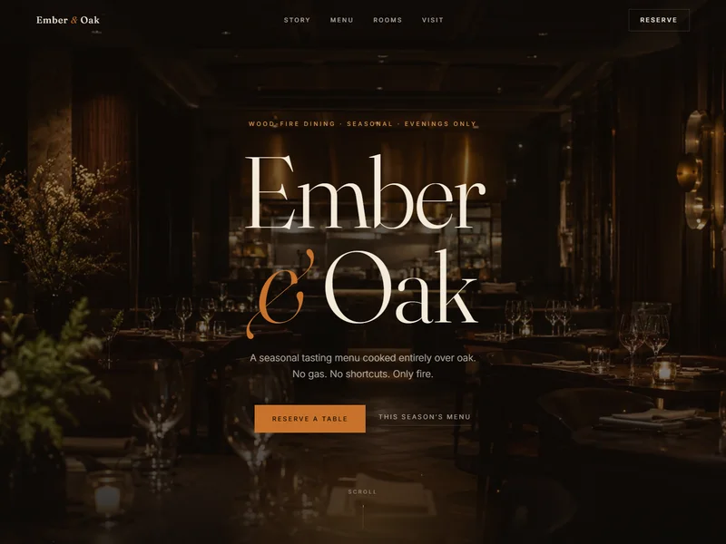
A candlelit editorial concept for an imagined fine-dining restaurant: oversized serif display type, hand-drawn SVG line art, ember-particle motion and a reservation-first page structure — built to show how we'd treat a restaurant brand that takes itself seriously.
Why this concept exists
Restaurant websites fail in two familiar directions: template gloss that says nothing, or PDF menus stapled to a Facebook page. Ember & Oak is our answer to the brief we wish more restaurants sent — make the website feel like the room, and make every word of it findable.
The design leans into candlelight: a near-black canvas, serif display type at poster scale, hand-drawn line art and drifting ember particles. The structure leans into commerce: menu as real, indexable text; a reservation action that follows the scroll; occasion sections ready for private-dining and event pages. The balance between those two — atmosphere that loads fast and converts — is the actual demonstration.
What a client version would add
A live restaurant engagement would extend this bones-first: local SEO and Business Profile work to win “fine dining + area” searches, booking-flow integration, occasion landing pages for festive menus, and short-form dish content feeding the discovery channels. The concept shows the ceiling; the engagement builds to it.
More concept builds
The rest of the shelf.

Slot five is open
Commission the real one.
These concepts show the ceiling. Your project gets the same craft — plus the campaigns, tracking and rankings that make it pay.